We all know how important it is for your website to look well on any device (our article on RWD here). So you may be wondering how to check the website on various devices without having to own them all. Sounds like the Lord of the Rings, but without the rings, right? 😉
As Spark Solutions software tester, it is my job to make sure that our clients’ websites are totally responsive and adjust to any kind of device which their potential customers might use. Let me share with you some of my testing tips.
So how to you make your PC imitate an iPhone 6?
What you need is emulation. It’s the ability of a computer program or an electronic device to emulate (imitate) another program or device. For example many printers are designed to emulate Hewlett-Packard LaserJet printers. It’s because a lot of software is written for HP printers. If a non-HP printer emulates an HP printer, it will be able to run any software written for a real HP printer and produce equivalent printing. The same may be achieved with your computer and any device you want to test your website on.
And now I will show you how to accomplish that using Google Chrome (no plugins required!). Launch the browser and press F12 (Windows/Linux) or CMD+ALT+I (Mac OSX).
This is what will pop up:
I hope all this code didn’t scare you. If you’re not a very tech savvy person, don’t worry!
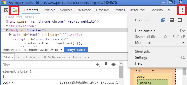
Have a look at the top left corner and the red square. Once you click this icon, all the scary stuff will go away.
Also in the right hand corner you can see another red box – there you will find an option to dock the window in a way you’ll find best suited for you. If you do not need to see the code, choose the blue icon on the left.
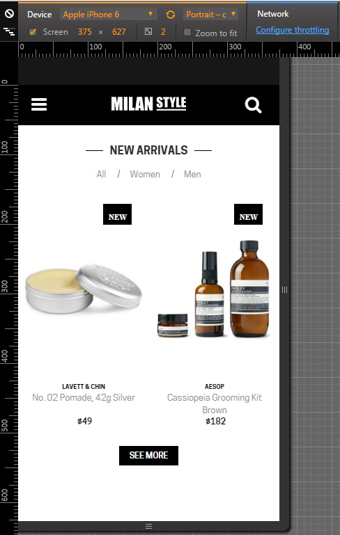
Now it looks much better, doesn’t it? In the top bar you have a menu that allows you to choose the device, on which you can test your web project. You will find a range of Apple (iPhone 5, 6, 6s, iPad Mini) and Samsung devices, followed by some LG, Nexus and even Blackberry.
You may also input your own custom dimensions to check how your website would present itself in that resolution.
That is not all, however. You may emulate some not very common resolutions and fit them to your screen even if it’s too small to do it physically. You also have touch controls emulation which is crucial for RWD (those manly fingers have limited touch precision compared to a desktop cursor).
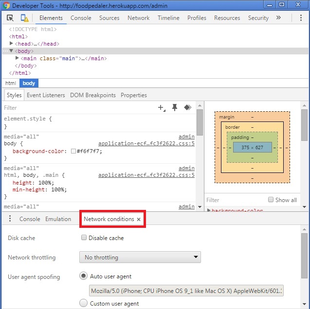
And one last thing. Thanks to the Network throttling feature, you’ll be able to see how your new and packed with lots of awesome features webpage loads with a slower internet connection. Since, as we all know, mobile connections are not always as fast as we would like them to be. In the new version of Chrome this feature is a bit hidden, but not too hard to find – you’ll need to go back for a moment to the window with all the code and look at bottom to find the tab “Network conditions”.
There are also some other possibilities that you might find useful, which I will tell you about in my next blog posts.
Header image used on a CC BY-SA 3.0 license – source: Wikimedia